Design/Mockups/Document Recovery
Appearance
< Design
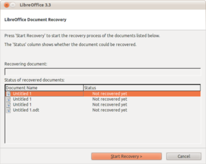
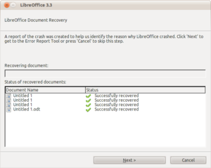
Current Workflow for Recovering Documents

The full specification incl. complete workflows is available at: OpenOffice.org Specification Project, Error Report UI Spec for OO.o 2.0
Good Aspects
- Informs the user of what it is
- Shows each document in an informative and clear way
- Gives progress
Bad Aspects
- Tells user each widget is about, rather than it being intuitive enough for the user to know what to do instinctively
- Gives no/little information on what happened/what it will do
- Lack of alignment make it visually confusing
- Gives no option to selected documents to recover (what happens if recovering a document leads to a crash - endless loop issue)
- Lots of wasted whitespace
- Too much repetition
- Incorrect string regarding Error Reporter (clicking next doesn't actually do what it says)
- Strangely sized buttons
- Too much clicking required (why wait after documents have been recovered)
- Gives false hope (documents in the list have a chance of not being able to be recovered)
- Interface changes too much between steps - it can flash
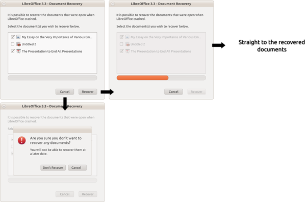
Proposed Workflow for Recovering Documents
Description
- When there are documents to recover, this dialog opens
- For each document to recover, there should be an item in the treeview consisting of
- An checkbox so the user can select whether he/she wants to recover this document
- An icon showing the type of document (word document, spreadsheet etc.)
- The name of the document
(The treeview should ellipsize (at the end) text too wide for it, but if the contents is too long for it, there should be a scrollbar to scroll the treeview vertically)
- The treeview should be usable until the 'Recover' button is pressed. At this point, it should become insensitive (not respond to user input and all widgets should become greyed-out but still visible)
- The progress bar under the treeview should be visible but have no indicator (i.e. no work is happening) until the 'Recover button' is pressed. At this point, it should display the current progress of recovering all documents, so that when it hits 100%, all documents have been recovered
- The two buttons at the bottom should be the same size and behave as normal. The 'Cancel' button when clicked should launch a modal confirmation dialog (as this is a destructive change, if the user doesn't recover the documents now, they are gone forever). When the 'Recover' button is pressed, it should cause the behaviour described above and start the recovery.
Discussion
- The dialog should also say "sorry" that LibO crashed -> exact wording needs to be worked out
- The proposal above does only cover some of the workflows described in the specification by OOo (see the link above)


