Development/VCL/WidgetLayout
TDF LibreOffice Document Liberation Project Community Blogs Weblate Nextcloud Redmine Ask LibreOffice Donate
Widget Layout
Widget layout is now in master. Disregarding any, hopefully minor, bugs it should now be possible to replace existing fixed size dialogs with replacements created with glade.
In order to edit dialogs you should do a 'make check' followed by
export GLADE_CATALOG_SEARCH_PATH=./instdir/share/glade
before running glade.
Rationale
- Pre-layout dialogs and contained widgets had fixed size. So in general labels, etc. had to be of sufficient fixed width to contain the length of the longest translation resulting in acres of white space in most languages and fundamental inability to resize dialogs without tedious per-dialog explicit handling.
- Units of measurement in the original .src format are in MAP_APPFONT, an arbitrary measurement of an idealized glyph size defined as 1/8 of a fairly arbitrary 8 character Latin script string which makes no real sense for languages using a non-latin script, or much sense for languages that do use a Latin script
- There was no visual editor for dialogs. So changing or modifying dialogs required incredibly painful procedure of editing of a textural description and compiling it before results could be seen.
- No mockups without supporting code possible
- Hiding a widget required lunatic manual re-positioning in code of remaining widgets by explicitly relocating their positions in code in terms of the dimensions of the hidden widgets.
- Because it's impossible to know the length of the longest translation before it's translated, every new dialog goes through a arduous cycle of being manually increased in size, and the component widgets manually re-positioned (in arbitrary MAP_APPFONT units which bear only a glancing relationship to the dimensions of the actual text being rendered) as translations come on stream which someone happens to see on screen overflow their allocated area and are clipped to fit or sprawl out of the allocated area to draw all over some other widget.
New Dialog Infrastructure
- The new dialog infrastructure reuses the gtk buildable xml file format, typically suffixed .ui. The ui editor glade can be used to create and edit dialogs visually to supply a visual editor and allow reusable mockups without supporting code.
- A standalone ui-previewer utility can render generic .ui files with vcl widgets
- Dialogs requisition the minimum size their contents require to be shown optimally.
- Hiding a container automatically hides its containees, and dynamically re-layouts the dialog, as does changing the text of e.g. a label, and similar events.
- vcl has been extended with a number of new Container widgets which implement layout and a vclbuilder class which can generate a vcl widget tree from a .ui description which can be used instead of the classic .src format.
- Some bridging utilities (uiex) are in place to handle .ui files in our translation system, these can go if we move to gettext in the future
- There are some new accessibility features introduced via .ui. Labels can (and should) have mnemonic widgets which become the default accessibility label-for. Explicit label-for, labelled-by, member-of, accessibility name and accessibility description can be additionally set.
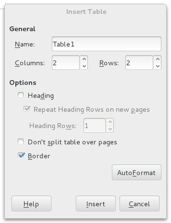
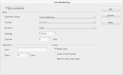
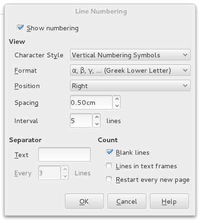
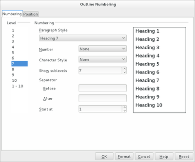
Screenshots
| Previous .src dialog | GTK+ 3 equivalent |
|---|---|
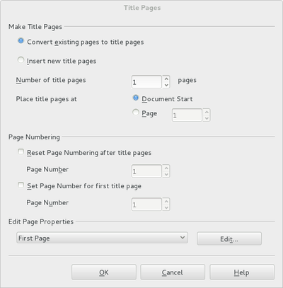
|
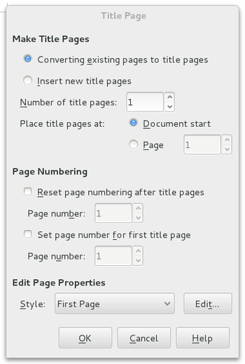
|

|
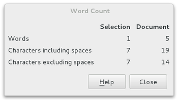
|
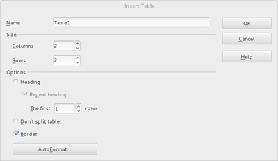
|
|
|
|
|
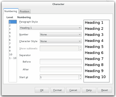
|
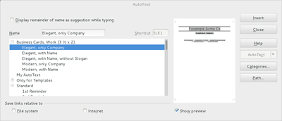
|
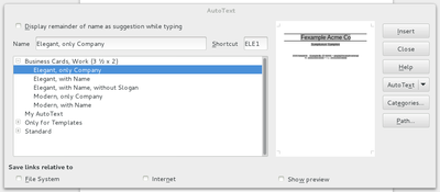
|
Available Container Widgets
| GTK3 Equivalent | VCL Equivalent |
|---|---|
| GtkHBox | VclHBox |
| GtkVBox | VclVBox |
| GtkHButtonBox | VclHButtonBox |
| GtkVButtonBox | VclVButtonBox |
| GtkGrid | VclGrid |
| GtkFrame | VclFrame |
| GtkAlignment | VclAlignment |
| GtkExpander | VclExpander |
| GtkNotebook | TabControl |
| GtkEventBox | VclEventBox |
Additional Grouping Support Utilities
| GTK3 Equivalent | VCL Equivalent |
|---|---|
| GtkSizeGroup | VclSizeGroup |
Available Basic Widgets
| GTK3 Equivalent | VCL Equivalent |
|---|---|
| GtkLabel | FixedText |
| GtkImage | FixedImage |
| GtkSeparator | FixedLine |
| GtkEntry | Edit |
| GtkDrawingArea | Window |
| GtkDialog | Dialog |
| GtkButton | PushButton |
| GtkRadioButton | RadioButton |
| GtkCheckButton | CheckBox |
| GtkSpinButton | NumericField |
| GtkComboBox | ListBox |
| GtkTreeView | ListBox |
| GtkComboBoxText | ComboBox |
| GtkScrollbar | ScrollBar |
| GtkTextView | VclMultiLineEdit |
| GtkLinkButton | FixedHyperlink |
Custom Widgets
For custom widgets use a custom widget name in glade of Library-Name, the vcl builder will then load the library module and call makeName to create the widget. Implement makeName like so for a custom widget NupOrderWindow which exists in the vcl project that creates a libvcllo.so under Linux and vcllo.dll under Windows
extern "C" SAL_DLLPUBLIC_EXPORT Window* SAL_CALL makeNupOrderWindow(Window *pParent, VclBuilder::stringmap &)
 {
     return new NupOrderWindow(pParent);
 }
Here's the corresponding xml snippet
<child>
  <object class="vcllo-ShowNupOrderWindow" id="orderpreview">
  ...
 </child>
Sadly, often these widgets aren't designed to be resized and just take their initial size to set up positions and font sizes. Easiest solution is generally to extract the init code, implement the virtual Resize method and re-call the init there followed by Invalidate to force a re-draw.
The lib-name scheme exists basically to make windows happy. If "lib" doesn't exist the idea is that we lookup "name" in the null/default/global scope anyway which should hopefully mean that the --merged-libs or android/iOS cases, if relevant, still work.
MetricFields, NumericFields and MetricBox
A GtkSpinButton is imported by default as a NumericField. There are occasions when its desirable to import them as MetricFields. MetricFields have units attached to them, e.g. cm/mm inside the spin field area. Rather than have custom widgets here, the current hack is to add the desired MetricField pattern as part of the widget id. So... Standard NumericField
<object class="GtkSpinButton" id="pagemargins">As a MetricField with a mm unit
<object class="GtkSpinButton" id="pagemargins:0mm">A related problem is that legacy NumericFields and MetricFields can describe that their spin buttons are omitted, again we overload the id, this time with "-nospin" to indicate that. So.... Standard NumericField
<object class="GtkSpinButton" id="pagemargins-nospin">As a MetricField with a mm unit
<object class="GtkSpinButton" id="pagemargins-nospin:0mm">MetricBox is to be defined as GtkComboBox in the .ui, but with unit attached as in the MetricField case, ie.
<object class="GtkComboBox" id="angle:0 degrees">RadioButtons
RadioButtons now have a true grouping feature with RadioButton::group so a chain of RadioButtons can form a group. The preexisting (I kid you not) mechanism of a RadioButton forming a group with its neighbour if that happened to be a RadioButton as well without an end-group bit set remains if no group is set so existing unconverted dialog continue to work
CheckBoxes
A vcl "TriStateBox" box is mapped to a GtkCheckBox that has its "Inconsistent" state set to true.
ListBoxes and ComboBoxes
GtkComboBox, etc. that have a model associated with them in the .ui file will automatically be filled with the contents of the model at load time. The first column is expected to be gchararray and if there's a second column that's expected to be gint and will be assigned as the associated data for that entry. Only the first column is a translation candidate.
A GtkComboBox does *not* map to a vcl ComboBox unless "has entry" is set to true. With false it maps to a vcl ListBox
ImageButtons
ImageButton should be converted to PushButton*. In Glade, create a GtkImage and set this as the Image widget under 'Label with optional image'. At the moment only some stock images are supported. See vcl/source/window/builder.cxx.
Guidelines
- Use "ok", "help", "cancel", "close", "save", etc. as the names for the ok, help, cancel, etc buttons. This is important to allow button reordering to match the current windowing environment rules. For message boxes, the button names of "discard", "cancel" and "save" enable the Windows+KDE save-discard-cancel vs GNOME+macOS discard-cancel-save layout rules.
- Use a translation context of "stock" for the generic ok, help, cancel that keeps translation size down and minimizes the need to change any existing code.
- Generally don't insert Separator lines to emulate frames like the old dialogs do, just use Frames. This is especially important for accessibility.
- Set what a label is a label for with the "Mnemonic widget" option in glade. This is especially important for accessibility.
- Don't use the simple html-style tags for bold/italic/underline in labels, use the pango font attributes instead
- A lot of our existing dialogs use a vertical button tower. If you want to reproduce that effect tweak a stock dialog's internal vbox to be a hbox and the hbuttonbox to a vbuttonbox, e.g. like this template Media:Vertical-template.ui
- See The GNOME HIG for guidelines for spacing and indentation
- Remove declarations of widgets that only appear in the .hxx and once in the .cxx in order to be initialized, e.g. labels whose contents are not changed by code, or buttons whose default handlers are not overridden. They don't need to be in the code anymore. Just search for the string in the .cxx, and if its only appears in the member init list then it can go.
- Otherwise convert Widget m_aWidget to Widget* m_pWidget and search and replace m_aWidget. to m_pWidget->
- Then remove the dialog member init entry of e.g. m_aWidget(this, RESID) and in the dialog ctor put get(m_pWidget, "id_string_as_in_the_ui_file"
- Remove the FreeResource line now that the dialog is no longer using resources
- point the dialog to use the right .ui file, e.g.
 SwSortDlg::SwSortDlg(Window* pParent, SwWrtShell &rShell) :
-    SvxStandardDialog(pParent, SW_RES(DLG_SORTING)),
+    SvxStandardDialog(pParent, "SortDialog", "modules/swriter/ui/sortdialog.ui"),
One may easily check if the ui file adheres to certain guidelines, by using the lint-ui tool - ./bin/lint-ui.py path/to/uifile
HOWTO: Step by step dialog conversion
Here's a hopefully helpful step-by-step tutorial for converting a simple dialog from .src to .ui
- Find a dialog that you want to convert. To find the corresponding .hrc/.src, take a piece of text from the dialog (anything that is long enough, like "Width and spacing"), and put it to "Full Search" in https://opengrok.libreoffice.org/ including the quotes (so that it does not find thousands of results). If you are lucky, you see 1 hit in .src file (in the case of the "Width and spacing" example it is "/core/sw/source/ui/frmdlg/column.src", unless it has been already converted to .ui :-) Another way to find a dialog is the Help button. Click in your choosen dialog on the Help button to get the online help of this dialog. If you're lucky you see an RID or something similar which you can search in opengrok. For example: Go to Impress -> Format -> Area, click the Help button and on the online help page you get RID_SVXPAGE_AREA:LB_AREA_TYPE which is what you want to search in the source.
- "ui-previewer" can be found alongside soffice.bin in the "program" dir of your office install, e.g. after a make dev-install it is ./install/program/ui-previewer
- Tutorial step #1 initial .ui prototype
- Tutorial step #2 improve .ui prototype
- Tutorial step #3 change Dialog constructor
- Tutorial step #4 remove redundant button widget constructors
- Tutorial step #5 remove redundant FixedLine/FixedText constructors
- Tutorial step #6 convert first remaining widget
- Tutorial step #7 convert remaining widgets
- Tutorial step #8 remove FreeResource
- Tutorial step #9 clean unused .src|.hrc remainders
- Tutorial step #10 update help for .ui conversion
If you would like to try to convert a dialog, and are not 100% sure yet how to do the code changes, then you could just start with demoing up converting a dialog in glade first and not worry about the code yet and Caolán can convert the code over to use the new .ui. The next time, you will be able to do even the code changes yourself :-)
HOWTO: Step by step conversion of sidebar .src's
Have a look at this series of commits:
The tutorial starts with the one that is listed as the bottom (Create .ui in glade.), and ends with the one that is listed at the top (Cleanup - remove .src and .hrc (if possible).) Sorry for this ordering, this is how cgit shows that :-) The instructions for the step are in the commit messages.
NB. The step "Introduce action commands in the .ui and .cxx." is probably not totally obvious - you have to search in the toolbars for the relevant uno commands, so that the icons are mapped correctly.
Key classes
- VclBuilder can load the .ui format and map the widgets to vcl controls. The ui-previewer is the simplest example of direct use.
VclBuilder aBuilder(pDialog, rtl::OUString(), "path/to/some.ui");
 Dialog *pTopDialog = dynamic_cast<Dialog*>(aBuilder.get_widget_root());
pTopDialog->Show()- VclBuilderContainer. This provides access to a VclBuilder and is a base-class for Dialogs and TabPages.
- Dialogs, TabPage. These now have constructors which take the path to the ui file and the id of the dialog/tabpage-contents in the ui file that refers to that Dialog/TabPage contents.
Dialog( Window* pParent, const OString& rID, const OUString& rUIXMLDescription );- VclContainer, the base class for all the containers. It asks widgets' size requisitions through Window::get_preferred_size and doles out the resulting allocations and positions to its children.
- Window, the base class for all the widgets/Controls. The new get_preferred_size backs onto the generally pre-existing GetOptimalSize for the usual case where the widget hasn't got an explicit size set in the .ui. Retro-fitted with various new halign, valign, grid attach positions members.
- Dialog control methods in vcl/source/window/dlgctrl.cxx, pre-existing spaghetti to traverse through a flat dialog widget hierarchy retro-fitted to walk transparently through containers
Testing a Conversion
- Ensure a default button is highlighted when the dialog opens
- Ensure that some widget has focus when the dialog opens (typically the first widget)
- Ensure that pressing tab traverses in a sane order all the visible sensitive widgets
- Ensure the widget-context-sensitive help (F1) takes you to the same help page as pre-change
- Ensure that the label mnemnonic-widget is set for labels that label another widget
- To review accessibility fire up orca and tab through the dialog
To Do Post-Integration
- unit tests for grid and fix unhandled edge-cases
- width-for-height and height-for-width support
Widgets requiring HIG guidelines review
See The GNOME HIG for guidelines for spacing and indentation. A summary is...
- Bold frame labels
- Every label that is a label for some other widget sets that target as its mnemonic widget
- Add editable controls have some label which set it as its mnemonic widget
- End label text with full colon (:)
- 12 pixels between label and widget being labelled
- 6 pixels border on top level dialogs/notebook pages
- 12 pixels left padding in alignment widgets for frames, 6 pixels top padding
- 12 pixels between frames
- Indent by an additional 12 pixels any sub hierarchy of widgets
- Use sentence case for checkboxes and radiobuttons (e.g. Like so, not Like So)
Awaiting Review
Completed Review