Design/Whiteboards/PropertiesButtonLayout
TDF LibreOffice Document Liberation Project Community Blogs Weblate Nextcloud Redmine Ask LibreOffice Donate
Summary
Most properties dialogs use too many buttons that only serve to confuse users (see Current State). Additionally, it quickly becomes tedious to click OK and then re-open the dialogue, because you want to change something. Finally, the dialog UI is not very forgiving as it doesn't allow atomic undo/redo actions. All of these problems should be solved.
Status
| Call for Proposals | Analysis of Proposals | Shaping Tentative Design | Implementation in Progress | Implemented |
Scope
| In Scope | Out of Scope |
|---|---|
also see Affected Dialogs |
|
Relevant Bugs
- tdf#37336—Feature request: Apply buttons
- tdf#36112—Combine Apply and Reset buttons (nb: this bug is obsoleted by this wiki page, as this page started with it)
Terminology
- Button layout: In this Whiteboard, only the row of buttons on the bottom of Properties dialogs are concerned.
- Modal: Blocking other user interaction (entering into a "mode").
- Global Undo/Redo: The Undo/Redo functionality that can be found under Edit > Undo and Edit > Redo, or within the Standard toolbar.
Owner
Discussion
Personas
- Matt: Matthew is 27, works in a web design company and evaluates LibreOffice Writer as a cost-saving alternative to Microsoft Office for (offline) business mail. He wants his work to be pixel-perfect/inch-perfect, but he still can't waste time. He's always worked on Macs, because he values good and responsive UI design.
- Brett: Brett is 40, an illustrator and is working with a client who gave him vector illustrations made in an outdated software to start from. Even though there may be better options for drawing, Brett knows that LibreOffice Draw is the only software he has that can read the files the client gave him. Alas! The import is not perfect and Brett needs to adjust a number of things and now that he's at it, he updates the illustrations in Draw, because the work flows so fluidly.
- Robertt: Robertt is using computers at work, but not very much, because he's always afraid of breaking something important. Worse, all computers that he ever worked with were shared computers, so he's doubly scared first, because he's relatively inexperienced and second, because he's always using someone else's computer. His company uses LibreOffice. For him, it is very important that he can safely undo any action.
Tentative Design
tbd later.
Proposals
Proposal by Astron
Mock-ups

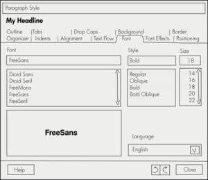
- The button layout on the bottom of properties windows is [Help] | [Undo/Redo] [Close]
- The [Standard] button might best be situated elsewhere, for instance on the Organizer tab (this change needs a redesigned Organizer tab, like:
 )
) - Changing any value in the dialog applies the value as soon as the user presses Enter or Tab or clicks outside the currently selected UI element.
- If Enter is pressed while the dialog is focused and when no UI element is selected, the default action, [Close], should be executed.
- If Tab is pressed while the dialog is focused and when no UI element is selected, the first element in the dialog should be activated (normally tab bar).
- If Tab is pressed while the dialog is focused and when a UI element is selected, the first element in the dialog should be activated (normally tab bar).
- Dialogs are not modal, but always remain above the main window.
- To avoid confusing users, after an accidental click on another item in the document that the same dialog can set properties for,
- there is a large caption above the tabs that changes according to the element (it would be helpful, if the names displayed were logical, an inserted image named mountains.jpg should not be displayed as Image 32)
- the selected element could have a glow around it or something similar (however, as a first step text could simply look selected). Please see the image to the right for an idea.
- However: the newly-selected item should be editable in the same dialog
- After an accidental click on another item in the document that the current dialog cannot set properties for, the caption should read "(nothing selected)" and the dialog should be grayed out or even collapsed.
- The global Undo/Redo function can be used to undo/redo single changes of values.
- Additionally, there is an Undo/Redo function directly on the dialog:
- the buttons for this function should use the same symbols that are used in the toolbar (although always the larger version to better fit the height of the button) – this creates familiarity and users might better understand that they could easily also use the global function
- the buttons could be combined to form a visual union – this would raise perceived simplicity
- these buttons gray out:
- if there are no further changes to be undone/redone for this dialog
- if there are no further changes to be undone/redone for this particular item (for instance, a style, or an image)
- if the most recent changed happened outside the dialog (this is sad but probably necessary to avoid making undo/redo history a mess and to keep changes in a linear order)
Relevant Art
LibreOffice: Current State
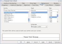
Current state, as of LibreOffice 3.4 (still applies to 3.5):
- The dialog is application-modal
- An [Apply] button applies different values without closing the window (only available in some dialogs).
- [OK] and [Cancel], or pressing Enter close the window.
- [Standard] sets all values only on the current tab to those of the current base style.
- [Reset] resets all values in the dialog to the state they were in when the current instance of the dialog was opened.
Sidebars in Inkscape

Inkscape, a cross-platform vector graphics editor, uses dock-able floating panels to present properties.
Pro:
- floats or is docked, oriented in vertical direction → gets out of the way
- when floating is non-modal, hovers above main window
- no screen space wasted on buttons
- changes are shown live (as properties are set)
Con:
- while easily resizable, docked window will take away some space from document
- more than five tabs take too much space on screen → dockable Preferences window uses a tree view instead of tabs
Floating panels in Scribus

Scribus, a cross-platform desktop publishing tool, uses a floating panel to present properties.
Pro:
- floating, oriented in vertical direction → gets out of the way
- non-modal, hovers above main window
- no screen space wasted on buttons
Con:
- somewhat longer mouse travels to switch between tabs
- vertical tabs can be a bit confusing, probably not scalable enough (some LibreOffice dialogs have over ten tabs)
- captions best be short, otherwise consumes too much horizontal space
- panels cover file content
Inspector in iWork

In iWork, an Office Suite for macOS, a floating window can be used for setting properties.
Pro:
- oriented in vertical direction = suited for widescreen
- non-modal, hovers above main window
- no screen space wasted on Close/Apply/Help/... buttons
- changes are shown live (as properties are set)
Con:
- covers document content
- horizontal tabs have no label, makes it harder to find the right category
Microsoft Office 2010 and 2011 for Mac Font dialog

In Microsoft Office 2010/2011, respectively office suites for Windows/macOS, a dialog is used for setting properties. Pro:
- explicit approval necessary to apply (no unwanted changes should happen)
- few tabs, relatively clean layout
- only 4 buttons
Con:
- same somewhat annoying workflow as in LibreOffice >3.4, if setting isn't correct the first time (open context menu → click → [OK] → open context menu → ...)
- no [Apply] button
Affected Dialogs
Dialogs that should be changed
|
|
|
|
|
Dialogs that should not be changed
|
|
|
|
|
(currently not complete, feel free to add to it)

